Archive | January, 2013

Sunsets and Silhouettes

20 Jan

cclark

Preparation: We pre-cut rectangles of black paper in 3 sizes – the width of the painting t and two smaller sizes. The painting were done on white paper using watercolors in sunset shades – blue, white, red, orange, magenta, yellow.

Lesson:

We talked about the life of “cowboy artist” C.M. Russell and his love of the American West. We showed photographs of sunsets and example paintings Eileen and her granddaughter had done, containing elements like mountains, trees, cactus silhouettes.

We distributed paper, 1″ wide brushes, paints and water. The students painted the sky at sunset, using long horizontal brushstrokes allowing colors to mix at the margins. While the paints were drying they cut out black shapes for their background and foreground elements, then glued the silhouettes onto their paintings.

Unrelated activity pages were used by the students to allow time for the watercolors to dry.

Room/Grade/Teacher: Rm 2, Kindergarten, Ms Beckley

Art Docents: Eileen Berlin, Cathy Clark, Harriet Eidelman

Art Elements/Artist: Watercolors/C.M. Russell

Ancient Egyptian Clay Cartouches

16 Jan

This slideshow requires JavaScript.

In celebration of Room 14’s unit on Ancient Egypt, we decided to make personal cartouches from clay.  In ancient Egyptian times, a cartouche was a “name plate” that was inscribed with hieroglyphs.  Using a hieroglyph translator chart, the students decoded their names and inscribed the symbols on a clay oval slab, creating a cartouche.

Lesson Overview:

I started out by explaining the lesson while the kids sat on the floor.  We talked about cartouches and I did a sample hieroglyph translation on the whiteboard with my name.  I explained that the first step was to accurately translate their name on to a piece of paper.  Then I demonstrated to them how to wedge the clay to remove the air bubbles and how to roll it out into a slab (about 1/4 to 1/2 inch thick) .  I then used a  cartouche template I had cut out  from tag board to trace the shape on to the clay.  (I cut out several of these for students to use)  Or,  I explained they could cut out their own cartouche oval without the template.  Then I explained that they would take their pieces back to their desks to work on the hieroglyph inscriptions and design.

Step 1:  We had the students practice their hyroglyphic names on a piece of paper.  Hyroglyphic charts can be found on the internet. Here is an example:  http://www.uhsda.com/wp-content/uploads/2010/04/hieroglyphics-table.jpg  Once they had successfully completed the translation, we set them to work on the clay.

Step 2:  I set out two old cloth shower curtains for the students to wedge and roll the clay on.  If you roll the clay on a desk it just ends up sticking!  (Think bread dough!)  Once they had their cartouche shape slab, they carefully carried it back to their desks and set it on a piece of paper to prevent it from sticking.  I used construction paper so that it would be strong enough to support the clay during the drying process.

Step 3:  Using their hyroglyphics paper rough draft, the students inscribe the design on to the clay using a thin pointy tool (toothpick, pencil,  clay tools)

Step 4:  I stored the cartouches on the shelf in the kiln room to dry for about a week and then bisque fired them in the kiln.

Step 5:  After firing, I brought the pieces back for the students to glaze.  They choose a lighter glaze for the background and a darker one for the hieroglyphs details.

Step 6:  Glaze fired the pieces and returned to the students (finally!)

Comments:  A ceramics project is a commitment of time on the docent’s part (and the student) but it is well worth it.  The students love working with clay and its great to give them the exposure to this medium.  Ceramics projects do break – part of the deal – but they can be glued with superglue after the bisque/glaze firings.  I highly recommend trying one ceramics project a year!

Art Elements covered: Form, Shape, texture, line, color

Art Docent: Kimberly Albert

Room 14 – Gaffney, 3rd grade

albertclan@aol.com

Mondrian

16 Jan

Room 4 Lesson on Mondrian – December, 2012

broadway boogie mondrian Room 4

Docent: Matt Schonwald-MBA
mattschonwald@gmail.com

Mondrian Shapes and Colors

16 Jan

Room 2 – Using Shapes and Colors in the style of Mondrian

DSCN8442 DSCN8444

Preparation: We pre-cut yellow, red and blue rectangles of various sizes, and 1 x 18 or 12 inch strips of black. The project was done on 12 x 18 white paper.

Lesson: We looked at Mondrian’s self-portrait and a photo of him when he was much older. We looked at an early representational painting, a painting from his cubism phase, and a geometic, basic colored abstract and explained how he believed in using only the basic essences of things in his work. Art, then, does not need to look like a real thing. Cathy showed a nature photograph, then how she made an abstract from it using the elements of blue sky, yellow sun, flower stems and red flowers.

We distributed the white paper and sets of the black strips and colored rectangles. We asked the students to start by gluing some black strips on the horizontal and vertical of the picture, then glue or cut and glue a few colored rectangles to complete the picture. When they gave their pictures to Ms. Beckley she asked them what was in their picture.
Lesson Title: Using Shapes and Colors in the style of Mondrian
Room#, Grade, Teacher: Rm 2, Kindergarten, Ms Beckley
Docent/s: Eileen Berlin and Cathy Clark

November, 2012 lesson

Email: catherinejclark@comcast.net
Art Elements/Principles/Artists Reviewed: lines and rectangles, basic colors

Wayne Thiebaud – color & multimedia art

16 Jan

cupcake1 cupcake2

(born November 15, 1920) Wayne Thiebaud is an American painter whose most famous works are of cakes, pastries, boots, toilets, toys and lipsticks.

While he was with the Navy, Thiebaud spent time in New York (on leave) and began painting the pastries and other “American” food that he would become known for. He was very interested in creating realistic paintings and he did this by using thick paint in exaggerated colors. When he painted cakes, for example, he applied the paint like a baker would spread frosting. The food in his paintings looks real enough to eat.

cupcake5

Vocabulary:

Multimedia artists are contemporary artists who use a wide range of media to communicate their art. Multimedia art includes, by definition, more than one medium, therefore multimedia artists use visual art in combination with sound art, moving images and other media. Multimedia artwork also frequently engages senses other than sight, such as hearing, touch, or smell.

Questions:

What dessert would you draw? And why?

How would your frosting look? Any bright colors?

Beginning of lesson…

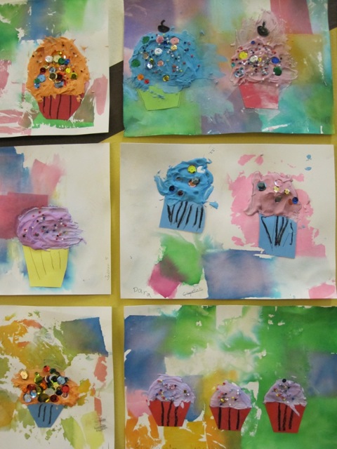
(names on front of paper in pencil) Students will arrange the tissue paper scraps on their paper, then brush the vinegar/water mixture over the scraps until they are wet and transferring the color to the paper. Volunteers will remove the tissue paper and let the pieces dry. Make compound/paint mixture at this point. Discussion time, then continue with the lesson.

cupcake4 cupcake3

Materials:

12” x 8” watercolor paper

Tissue Paper scraps

Mixture of distilled vinegar and water

Paint brushes to brush vinegar/water mixture

Colored paper for cupcake “liners”

Wall compound (powdered form #90) mixed with tempra paint (4 colors) and water

Micro beads and sequins for on top cupcake

Black oil pastels for texture on cupcake liner

Popsicle sticks

Scissors & Glue sticks

Paper plates to mix wall compound

Paper to cover desks

Lesson:

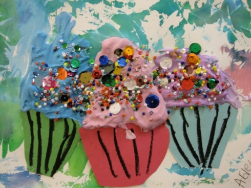
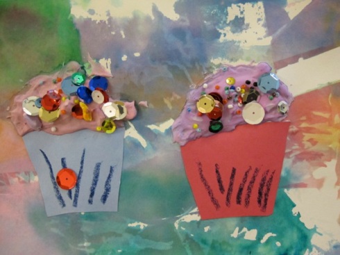
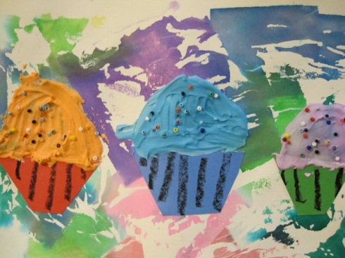
  • Choose colored paper and cut two cupcake liner shapes, rounding edges. And glue to paper leaving space for “frosting”.
  • Draw black lines on the cupcake liners
  • Choose “frosting” color and spread with popsicle stick.
  • Embellish with beads and sequins.
  • Let dry overnight.

2nd grade, Ms. Schroder, Room B3
Art Docent: Marcie Guthrie
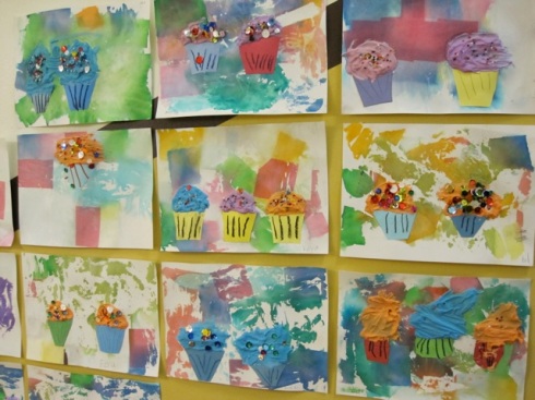
Art Elements/Principles/Artists Reviewed: Texture/Color/Wayne Thiebaud
Print used: various paintings of his desserts